Being born and raised in Philadelphia proper, I have accrued many strong opinions about wayfinding systems over the years, riding our public transit system SEPTA.
Here’s an example from 2018: A detour sign posted at one of the bus stops by 8th and Walnut streets, unlike any I hath ever laid eyes on.
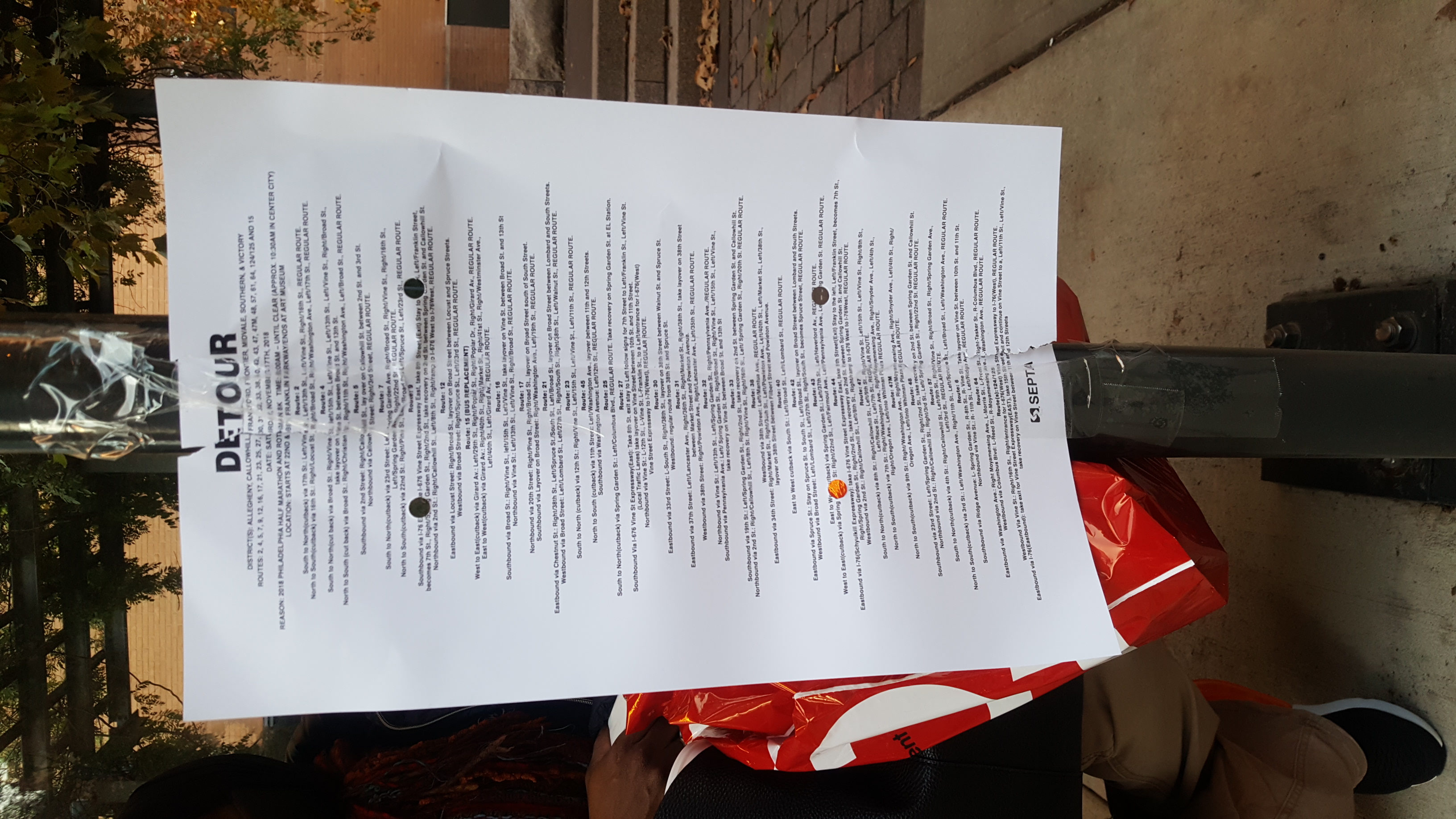
This is an 11″ x 17″ piece of paper, posted at thigh level, facing out towards the street. It lists around 29 bus routes each with occult directions, seemingly for the operators. The type is somewhere around 10pt, maybe even 9. The first legible thing on the page is DETOUR. If you zoom in, you can see the reason is due to a marathon race.
There’s so much to say, right? My reaction when I got to my bus stop that day was, wtf is this? Why put detour information in such a tortuously small type size? Why is it posted where it is and not facing into the bus shelter? I struggled to read the information below each route until I realized it wasn’t for riders, and then flippantly waved the sign off and took my post at the stop. Nobody else seemed to notice it was there.
Frankly, the real question for me is, how does a sign with directions for operators get formatted, printed out, and taped up here? But also, a marathon race is going to affect ridership on 29 different routes and how are they to know? Do you think this exact sign was put up along each of the affected routes, or was this one a fluke?
As a transit agency, SEPTA unveiled a dedicated wayfinding system in 2024 as part of its branding refresh/reorganization to SEPTA Metro. That was last year, y’all. Before this update, I joked over the years about applying to being in charge of SEPTA’s signage and wayfinding, because they didn’t seem to have much resources dedicated to the task as far as I could tell.
To me it seemed mad for SEPTA to be such a large transit system without dedicated, proactive resources for last-minute/event/emergency signage all these years. So many times have I wandered lost in search of the next detour sign or any sign that could tell me where my route picks up or that my bus won’t be coming at all. Years ago, I drafted a comprehensive guide to riding SEPTA, with sections like, How To Tell If A Vehicle Is Late, and, Paying With Cash and Change.
I still have so much to say, about investing in communications and design even on tight budgets, about making things that people don’t have to struggle to engage, about my user experience riding transit systems in other US cities, East Asia, Central America, and Europe. But what I want to hone in on here as we prepare to part ways, is that signage like today’s example is ultimately demoralizing. You work on your feet all day, you’re tired, it takes you an extra hour to get home because you didn’t realize your route had been detoured, you had to go walking blocks and blocks to find the next pickup. Your precious time has been stolen from you. It sucks! This is how impactful inconsiderate signs are. I’m sure we’ve all got our own stories about them.
Here’s to a future of beautifully useful service communications.