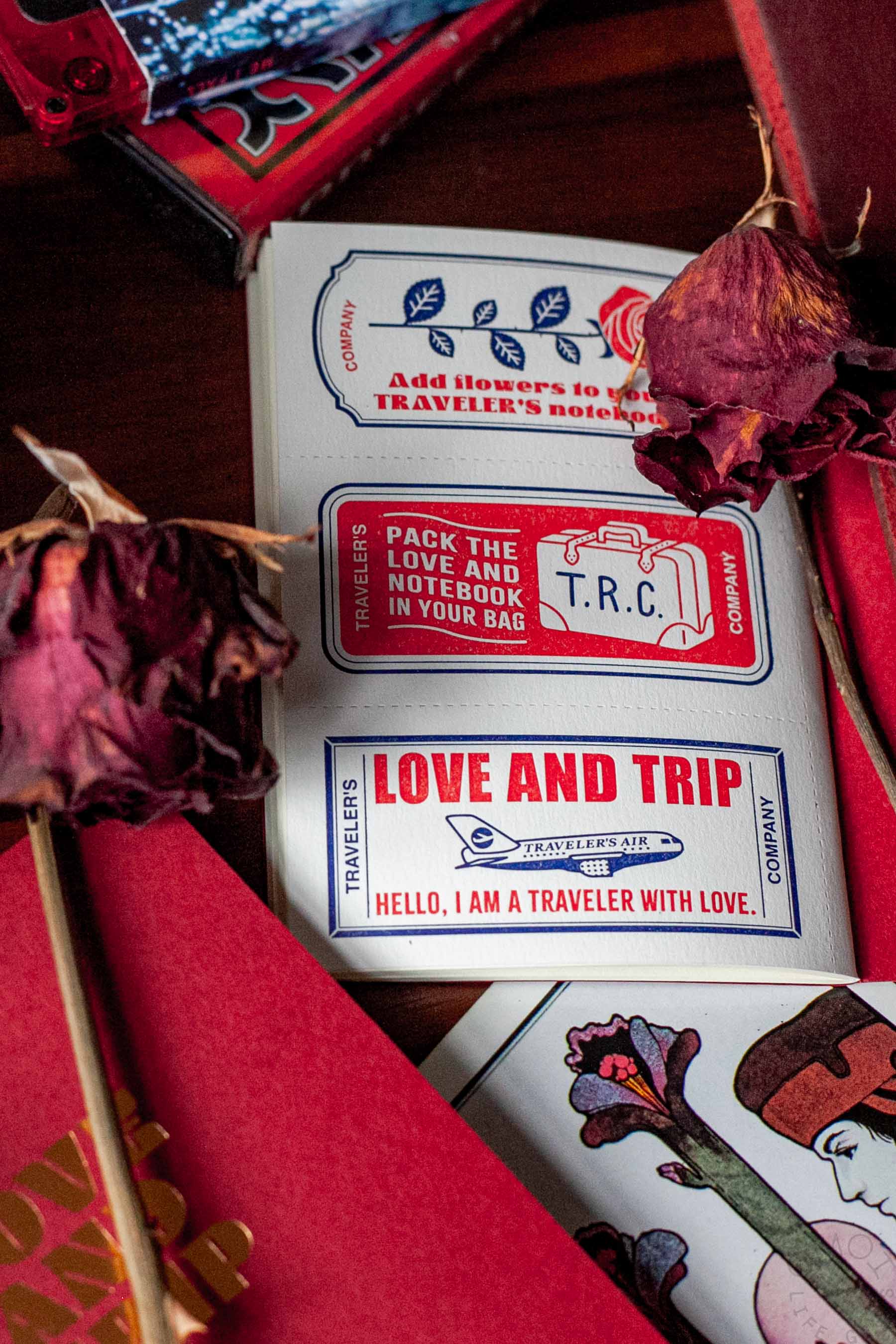
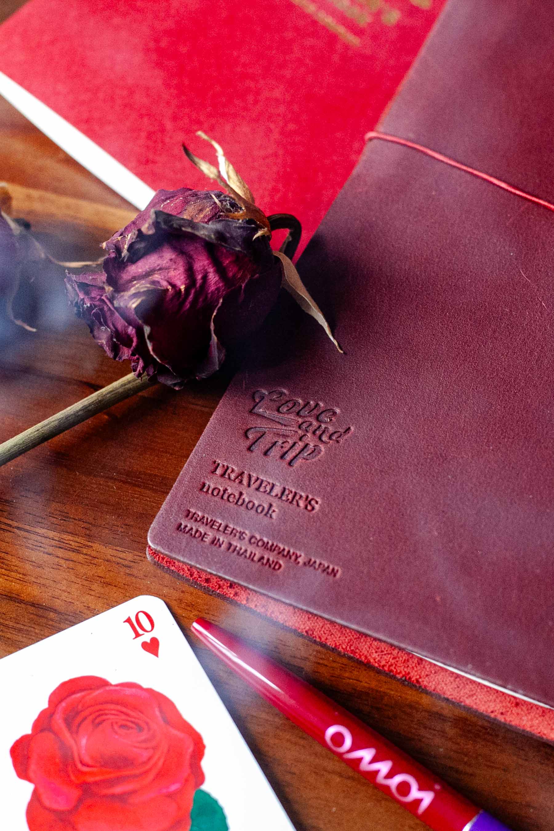
LOVE AND TRIP was the 2025 theme for cult Japanese stationery brand, TRAVELER’S COMPANY (TRC), producer of the original TRAVELER’S notebook (TN), a customizable notebook system with various inserts, all housed inside a leather cover meant to age beautifully with use over time, becoming a treasured item to its user.
At the time of its release, I was working for Omoi Life Goods, an official TRC Partner Shop, and so we were privy to all the special release information well in advance in order to coordinate marketing in time for its debut.
Past yearly themes were centered around records, books, even a fictional TRAVELER’S TOWN during the pandemic lockdowns—all very enjoyable and relatable. But when the 2025 theme was revealed to us, I was moved by its subtle way of speaking to the tumultuous post-lockdown era we were all living in by encouraging us to be curious and seek connection and commonality with each other.
When the limited edition LOVE AND TRIP red leather cover was to be released, a couple months after the initial theme announce, the official English copy struck me as tame, centering on the symbolism of red in love and friendship. Meanwhile, on the company’s official Japanese-language blog from March 10th, its influential author Ijima spoke more candidly about this red:
I think we started working on the red TRAVELER’S NOTEBOOK prototype about four years ago. At the time, we didn’t have a specific release schedule in mind, and just thought that if we were to make a new color next, red would be a good choice, so we asked for a prototype.
For example, the red of satin and corduroy that Jimi Hendrix or Janis Joplin might have worn in the heyday of psychedelia. The red of the velvet curtains hanging in the dark and mysterious hotel rooms of 1960s Hong Kong that appear in Wong Kar-wai’s films. Katsushika Hokusai’s “Red Fuji” and Matisse’s “Atelier Red.” The red of the dimly shining morning sun before the sky brightens.
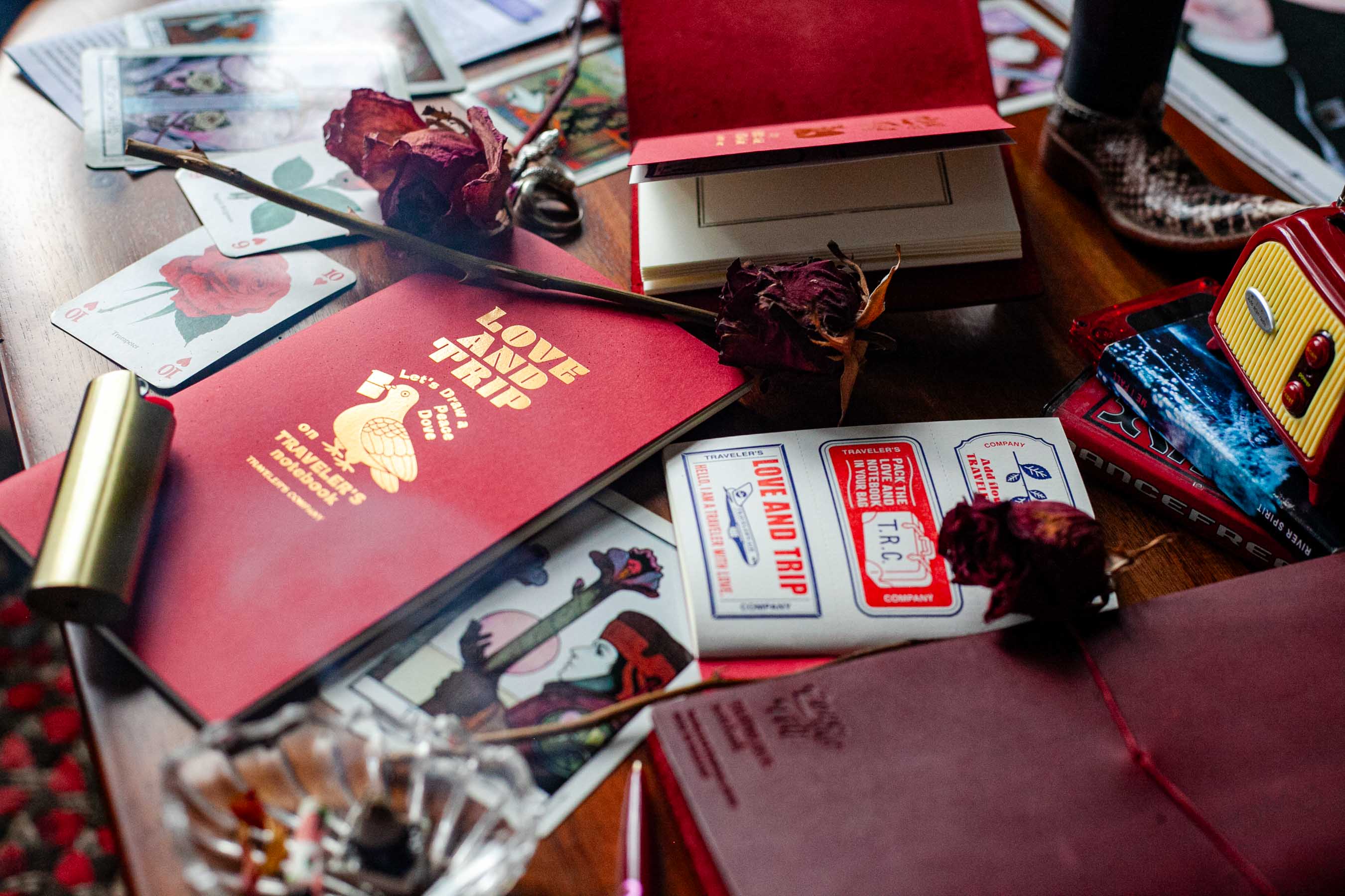
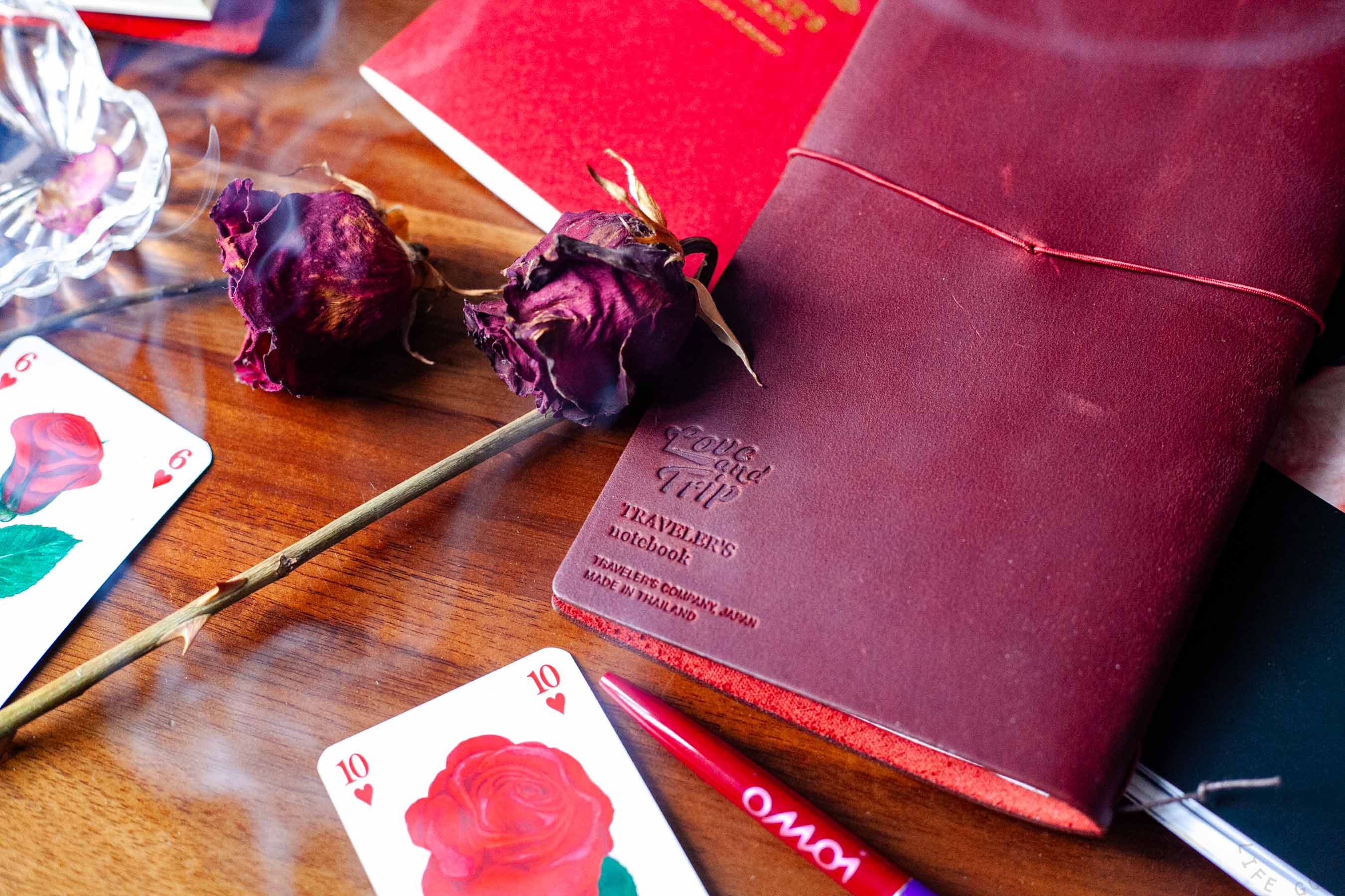
That analogy is a little hard to understand. Basically, what I was aiming for was not a bright red, but a deep, dark red like wine red or burgundy. It was a red that barely managed to retain the sexiness and brilliance of a red that makes people stop and stare, like a bouquet of roses, the body of a Ferrari, or the sweater and lipstick worn by Nastassja Kinski in the movie “Paris, Texas” (I first saw this movie when I was in high school, and was struck by its beauty), while also giving off a dark shadow and a natural impression like reddish-brown earth.
a red that makes people stop and stare, like a bouquet of roses
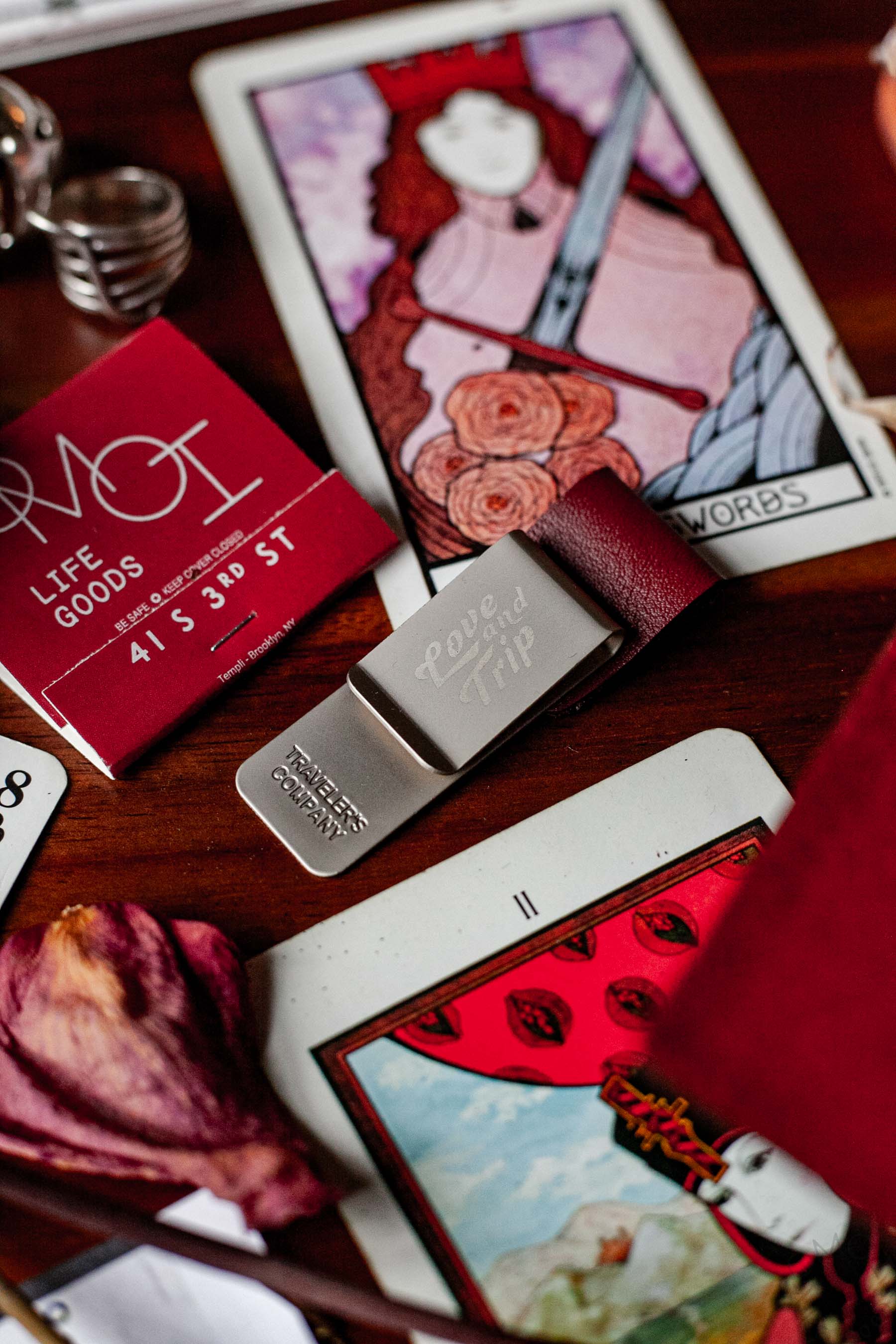
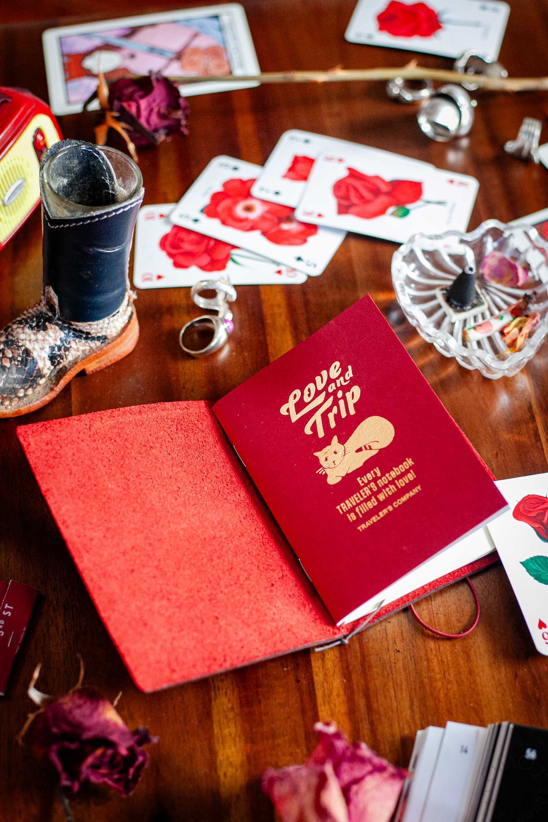
I didn’t expect to be so passionate to do a product photoshoot for a limited release that we all knew would sell out in hours, but as you can perhaps see, the evocative copy of Ijima-san gave me a lot to work with. I brought in a bag full of personal affects (including the dried roses~!) that I thought would bring out the lesser-known and more culturally dense narrative tucked away in the Japanese-language blog and went to town.